
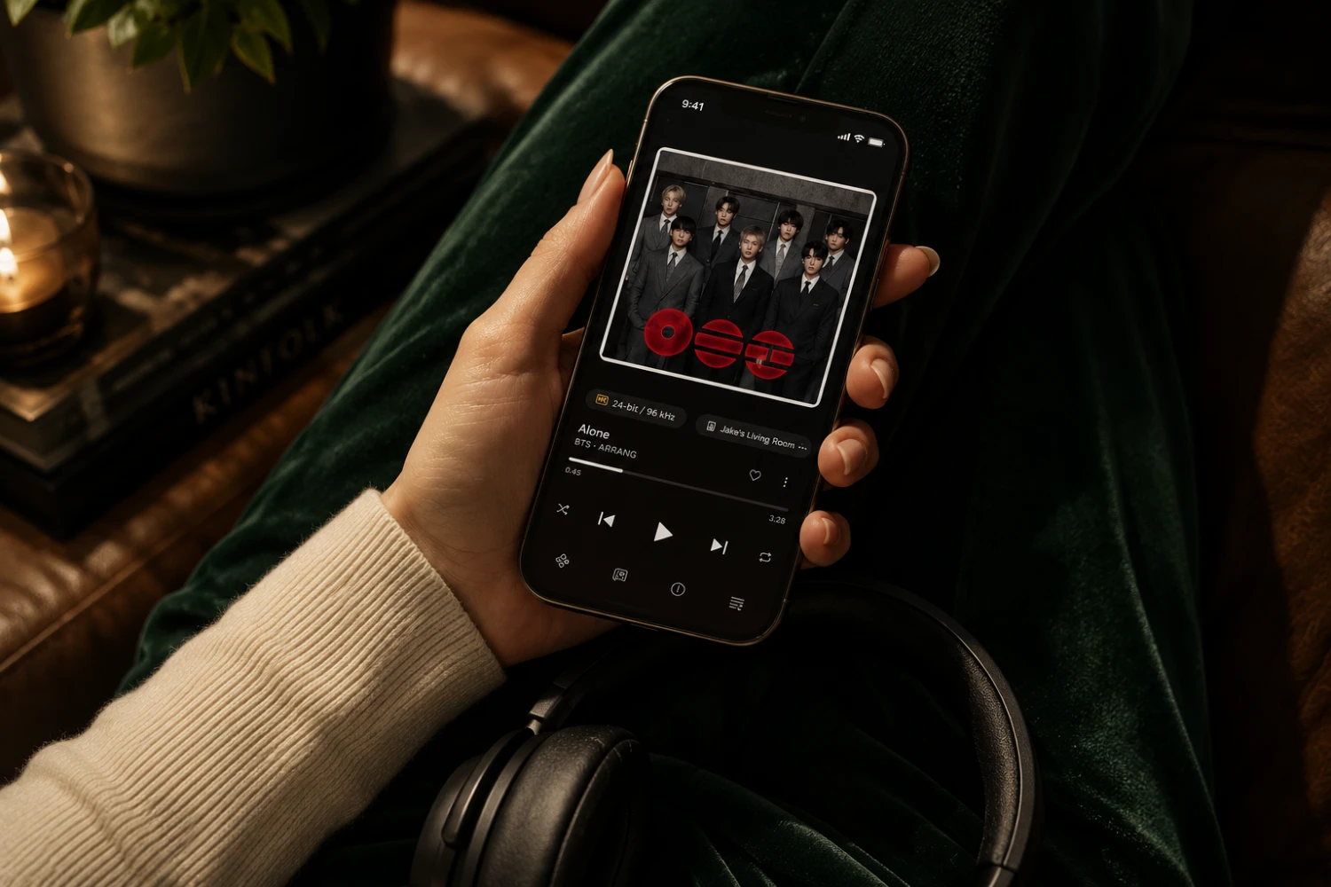
Qobuz has refreshed its mobile apps for iOS and Android with a set of changes that focus less on adding complexity and more on improving the everyday listening flow. The update gives the playback screen a stronger visual identity, adds synchronized lyrics that move in time with the music, keeps essential controls accessible through a persistent mini-player, and makes better use of tablet displays through a split-screen layout. For a service whose appeal is closely tied to album presentation, editorial context and a more intentional approach to listening, these interface changes are not cosmetic details alone. They affect how easily a subscriber can move between playing, browsing, reading and following a song without repeatedly interrupting the session.
A player screen built around the album
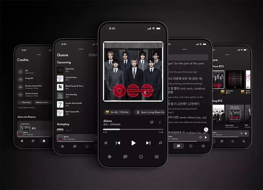
The most immediately noticeable part of the updated Qobuz mobile app is the redesigned player screen. Album artwork now plays a more prominent role, placing the visual identity of the current release at the center of playback rather than treating it as a supporting graphic. That matters in a music app because cover art is often the fastest way to orient the listener: it identifies the album, sets a visual tone and reinforces the sense that a track belongs to a larger work.
For listeners who still think in terms of albums rather than isolated songs, this design choice feels especially relevant. A strong playback screen can make a phone or tablet feel less like a remote control and more like a digital version of the album sleeve sitting in front of the listener. Qobuz has not detailed every visual behavior in the refreshed interface, but the player is designed to change dynamically during playback, giving the screen a more responsive connection to the current music session.
This is a practical improvement as much as an aesthetic one. A visually clearer player reduces the feeling of being buried in menus, and it helps make the currently playing music the center of attention. In a crowded streaming environment where many apps compete through feature volume, Qobuz’s decision to give the main playback screen more presence is a direct investment in the part of the app that subscribers use most often.
The mini-player keeps listening and browsing connected
The addition of a persistent mini-player is one of the update’s most useful everyday changes. Instead of forcing users to return to the full player screen whenever they want to pause, resume or manage what is playing, Qobuz now keeps essential playback controls visible while the user moves elsewhere in the app. This makes the mobile experience feel less divided between listening on one side and discovery on the other.
That continuity is important because streaming rarely happens in a straight line. A subscriber might start an album, open an artist page, look at related releases, move into a playlist, or read editorial material while music continues. Without a persistent control area, each of those actions can create small interruptions. The mini-player reduces that friction by allowing playback to remain present even when the user is exploring the catalog.
For hi-fi listeners who use a phone or tablet as a controller during longer sessions, this kind of interaction design can be more valuable than it first appears. It supports a calmer way of navigating: the music does not disappear behind the interface, and the interface does not constantly pull the listener back to a separate control screen. The result is a more integrated app experience, especially for subscribers who browse actively while listening.
Synchronized lyrics add a more active listening layer
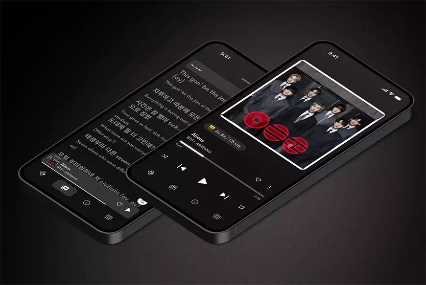
Real-time synchronized lyrics are another headline addition to the Qobuz mobile apps. Lyrics now scroll in time with playback, allowing the listener to follow the words as a song progresses. This feature has become familiar across music services, but its inclusion here gives Qobuz subscribers a more interactive option inside the player rather than requiring them to search elsewhere for the text.
The value of live lyrics depends on how a person listens. For some, lyrics are useful for checking a phrase that was difficult to hear. For others, they are central to understanding the structure, rhythm and emotional direction of a song. By placing synchronized words within the mobile playback experience, Qobuz supports both casual curiosity and more focused listening without changing the basic function of the app.
The feature is also relevant for shared listening. On a tablet, lyrics can turn the screen into a companion for the room; on a phone, they make commuting or headphone listening more engaging when the listener wants to follow a vocal line closely. The important point is that Qobuz has integrated lyrics as part of the main mobile update rather than positioning them as a separate layer detached from playback. That keeps the feature simple and immediate.
Tablet split-screen mode uses the larger display more effectively
Tablet users receive a distinct benefit from the update: a split-screen mode that allows listening and browsing to happen side by side. Rather than simply stretching a phone interface across a larger display, the new layout takes advantage of the additional screen area. Users can continue playback while browsing albums, artists, playlists and editorial material within the Qobuz app.
This is a meaningful distinction because tablets are often used differently from phones. A phone is usually a personal, quick-access device. A tablet can be a living-room controller, a sofa browsing tool, or a more relaxed screen for exploring music during longer sessions. Split-screen operation recognizes that role by allowing the listener to keep playback visible while moving through the catalog or reading around the music.
For subscribers who use Qobuz in a home hi-fi context, the tablet update may be particularly attractive. It supports the kind of listening session where music discovery, album selection and editorial reading happen at a slower pace. The larger interface can show more context without requiring constant back-and-forth navigation, making the tablet feel like a more purposeful part of the listening system rather than just another mobile device.
Designed for subscribers who move between control and discovery
The update’s strongest theme is flow. Qobuz has not framed these changes around new subscription tiers or altered pricing; the focus is the experience of using the app day to day. The redesigned player improves the visual focus of playback. The mini-player keeps controls available while browsing. Live lyrics add a synchronized reference for vocal tracks. Tablet split-screen mode makes the app more useful on larger devices.
Taken together, these changes serve listeners who do not simply press play and put the device away. They are aimed at subscribers who browse albums while listening, move between artists and playlists, read editorial material, or use a mobile device as a central part of their music routine. The update also suits people who value presentation: album artwork, lyrics and layout all contribute to the sense that the app is designed around the music rather than just the mechanics of streaming.
At the same time, the update may be less significant for users who only use Qobuz in the background or rarely look at the app after playback begins. The new interface features are most useful when the screen remains part of the experience. Listeners who primarily rely on external controls, voice commands or purely passive playback may notice fewer practical benefits than those who actively navigate the service.
A mobile refresh with a clear usability purpose
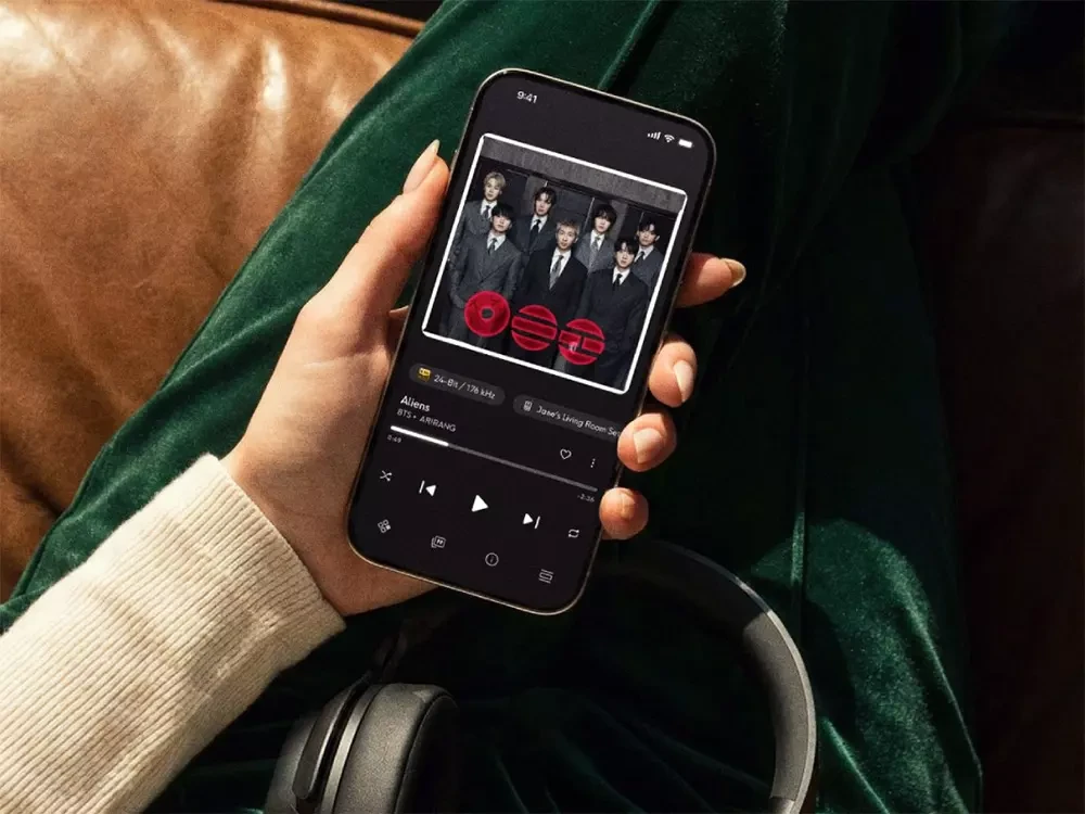
What makes this Qobuz update notable is that its main additions are easy to understand and directly tied to common listening behavior. A more visually centered player makes the current music easier to identify and more engaging to look at. A persistent mini-player reduces unnecessary navigation. Synchronized lyrics help users follow songs more closely. Tablet split-screen mode gives larger screens a real job to do.
None of these features changes the fundamental purpose of Qobuz as a subscription music service, and the update does not depend on new hardware or a separate add-on. It is an app-level refinement for existing subscribers on iOS and Android. That gives it practical relevance: the improvements are located exactly where many listeners interact with the service most often, whether on a phone during daily listening or on a tablet in a home system.
The design direction also aligns with a broader expectation for modern music apps: playback, discovery and context should not feel like separate compartments. By keeping the active session more visible while allowing the user to explore, Qobuz makes the mobile interface feel more coherent. For a listener who values both music selection and presentation, that coherence can make the service easier to live with over time.
Conclusion
In conclusion, the updated Qobuz mobile apps are strongest where they improve the ordinary moments of listening: seeing the album art clearly, keeping playback controls within reach, following lyrics in real time and using a tablet screen for simultaneous playback and browsing. The update is best suited to Qobuz subscribers on iOS and Android who actively engage with the app while listening, especially those who browse albums, artists, playlists and editorial content during longer sessions. It is a focused usability refresh rather than a reinvention, but its documented strengths make the mobile experience more visual, continuous and flexible.



Sound Off
0Join the discussion if you have something to add.