
The hamburger menu is an additional panel that, by pressing the “ ≡ ” button, moves out over the interface. In 2022, two Google branded apps at once received such a menu, which developers have long abandoned: first, users noticed it in the beta version of Google Photos, but it didn’t work, and then the same option appeared in Messages, and in them it is now fully functional. In the past, the hamburger menu was used everywhere, but it has long been abandoned – its return from Google looks as ridiculous as possible, and I can prove it.

The hamburger menu is called that because its button icon looks like… a hamburger | DailyCMS
For many years, starting with Android 10, developers have been promoting gesture navigation – it is used by default both in branded Pixel smartphones and throughout Android in general. One of the key features of green robot gesture navigation that differentiates it from the iOS implementation is the back gesture. On the iPhone, if you want to go back, you either have to press a button somewhere in the user interface or swipe from the left edge. On Android, you need to swipe from either the left or right edge of the screen.
Like the obsolete back button in iOS, the hamburger menu in Android appears in the upper left corner (sometimes in the right) – it is used very rarely, so I don’t worry much about its inconvenient location (in the realities of 6.5-inch smartphones) . What worries me more is the fact that these slide-out menus, like the one recently introduced in Messages, are fundamentally incompatible with the modern standard in Android – gesture navigation, which, in my opinion, is the best solution that has ever existed in the system.

The design of the hamburger menu icon can be different, but the essence is the same
The peak of popularity of the hamburger menu came at a time when smartphones were relatively small. In addition, the swipe back gesture had not yet appeared, and the hamburger implementation of the interface fit very well into the overall concept – it seemed to imitate physical space and proximity, making complex user interfaces more understandable at an intuitive level. Dimming the background when opening the hamburger menu made it feel like an additional panel was floating above the rest of the interface, and it really made the system easier to read.
However, in the last few years, swiping horizontally has taken on a different meaning – going back. In this regard, the developers have moved away from the concept of a hamburger menu, but not all. Even Google could not completely abandon it: it disappeared from Google Play and Google Weather, but remained in Drive and Gmail.


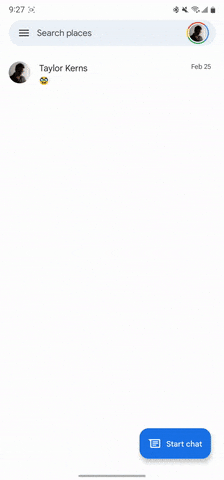
If three-button navigation is enabled, a swipe from the left brings up the hamburger menu
So what should developers do to fix the situation? At the very least, slide animations should be abandoned if the community is really going to go back to hamburger buttons. This animation was used precisely to inform the user: there is an additional panel to the left of the screen, which can be pulled out with a swipe from left to right.
If the user has gesture navigation enabled (which is the default), this slide-out animation becomes confusing: does a left-to-right swipe go back or open the hamburger menu? Everything is aggravated if the same horizontal swipe is used in the application to interact with elements under the finger – for example, to archive a chat in the same Messages.
If gesture navigation is enabled, a swipe to the left returns back, but the hamburger menu closes with the same swipe back
All this makes life even more difficult for application developers who need to consider both new and old implementations, and this is terribly regressive. As a result, users of a modern control system are also confused, and application developers do not know what to do.
In the modern interface, the same Google, as a rule, fits all the elements of the old hamburger menu into a pop-up panel by clicking the user’s avatar in the upper right. Therefore, applications that have both the hamburger menu button “ ≡ ” and the avatar icon at the same time are only confused. Some third-party applications use a completely different implementation: for example, Discord and Slack also have a gesture interface, but it is intuitive and creates an overlay effect, as if all screens are cards on top of each other. This idea is clearly better than the Android 4.4 KitKat era menus.
The standard “ ≡ ” icon and similar ones are unlikely to be abandoned – they have been popular since the 1980s, people are already used to them and subconsciously know what is hidden behind these icons. But the way Google uses such buttons now hasn’t kept up with how modern Android works. Gesture navigation is a modern evolution of the mobile experience, and if Google wants to use the hamburger menu again, then its implementation needs to be redesigned for modern realities.